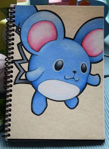
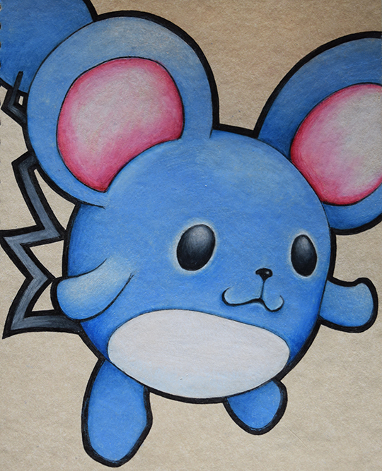
 I mentioned in the previous post that I like doing pokemon drawings because they are simple designs that are easy to customize. I picked this guy because my colored pencil collection is still a bit weak. I have the blues all covered and that is the Marill’s main color. It was able to expand my greys and then start my reds. I am still getting a feel for the pencils and the larger areas of blue proved to be more of a challenge. I was anticipating this which was why I started with the snake-like Dratini. I am still thoroughly impressed with the quality of these pencils. Even in the places the drawing became overworked, I’m not entirely sure it was due to the pencils. I didn’t put much thought into the paper. I picked it because of the color, not the finish or coating. It most definitely is not a drawing paper. The finish is not coated but it is very smooth. There are a couple places that the paper just wouldn’t take the pencils right.
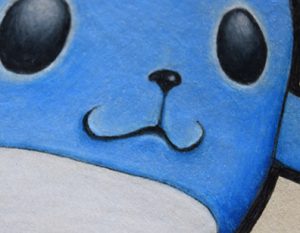
Another issue that arose was the fact that these pencils are so opaque. I actually love the fact that they are so opaque. One of the things I knew I wanted to add to the Marill was a cute little nose and a philtrum. When I drew the mouth I really liked the shape but the groove was slightly off. I tried to fix it when inking but there was still something that was slightly off. The philtrum was too abrupt. Using the opacity I was able to add some nuance to the area. I could not be happier with how it turned out. This is actually my favorite part of the drawing. This is why I wanted to take better pictures, so I could add a nice detail pic. The only problem was after I was done with the colors I had to go back over the dark ink lines to crispen them back up. Looking at this detail pic, I might have to go back and clean up the fine line around his white belly.
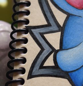
The other area that I really like is the tail. The tail was a bit of a happy accident. I picked up a black pencil and a couple dark grey pencils but they were so dark that it all ended up just looking black. I went back over adding highlights using white and then blending it in with the dark grey which ended up with what almost looks like paint. Once I went back over the black ink, it just emphasized the pencil strokes and textures. Now I’m wondering if I can build on this technique to add amazing textures to my next drawing. It could look really great as hair or fur on a wolf or something. One of the things I try to avoid when drawing with colored pencils is just laying down flat solid colors. There is a time and place for that kind of thing but I don’t think that is the best way to utilize colored pencils. I like to do solids and posterization when I’m painting because I think acrylic paint lends itself well to that but not colored pencils.
So there you have it. The Marill is complete. I’ve already started a new drawing but it is still in its very early stages. I will post some pics next week.


